In this part we discuss the environment and level design principles. We bring out the rationale game developers should consider when building their levels and positioning the player.
The players must feel as if they are part of the created world. Game developers and artists work hard to provoke this feeling in the players. HTC Vive helps a lot in this area by adding immersiveness. The art style does not need to be realistic for the player to feel immersed in a VR game. This means that levels can look either realistic or cartoony or stylized in another way. The goal should be to create a world that looks consistent.
The levels should guide the players toward their goals. In Tribocalypse VR (TVR) the goal of the player is to defend the village from raiding enemies. For the level to guide the player it is important that the player knows where the enemies are coming from and where should the player character be located. It was also important to make the levels of TVR interesting and not feel mundane after couple of play sessions. To achieve this, multiple paths for enemies were added. This forced the players to very often shift their focus from one place to another. It also gave more value to the teleportation system, which made the players choose a more strategic location depending on the situation.
In levels of TVR, the enemies spawn from big portal gates, a small distance away from the village. The portals, that are active and spawn enemies, glow green.
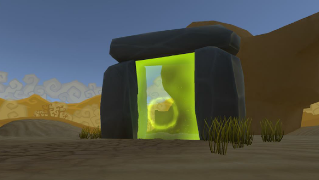
Most of the players who tried TVR the first time (at public expositions and at private testing) had problems locating the first enemies who attacked them. Often the players noticed the enemies only when they had already arrived at the village. When asked the testers why this was the case, the answers were all very similar: they did not know to look at the place where the enemies initially spawned even though the portals emitted light.
There were 3 main reasons we think the players did not spot the enemies:
- The gates and the enemies were simply too far away and were visible only when the player knew to look for them and concentrated their vision further away from the village. Instead they often looked at the details in the village, which they were protecting. Also the gates and enemies were quite small on the background.
- The spawning action of the enemies was not made clear enough to the player. The audio effect was too quiet and the visual effect too small.
- The portal effect blended in with the rest of the world because every first wave on each level starts during daytime. A lighting change far away often goes unnoticed when that change does not produce enough contrast compared to the rest of the environment.
There are many possibilities to resolve this problem. The key is drawing the player’s attention. This can be achieved by sound and visuals. For example, the portals could be placed closer to the village or the mountains around the village could be slightly pointed towards the portals, which helps guide player’s vision. The lighting around the portals could be made brighter and the visual effect of the enemy’s spawn bigger and more noticeable. Perhaps add a beam of light that falls down from the sky into the portal each time an enemy spawns, coupled with a loud enough sound effect. Whatever technique used, it is essential for the player to understand at any given moment, which part of the level to look at. A good book to read on the subject matter would be “An architectural approach to level design” by Christopher W. Totten.
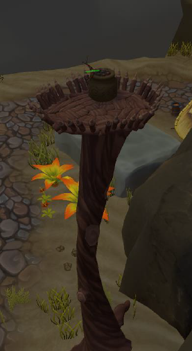 We also had to decide what would be the best place where to position the player. We concluded that we needed the player to be above the enemies. This is when we came up with the tree platform design (see illustration to the right). The platform is at the height of 10 in-game units (10 meters) and has a radius of 2 in-game units (2 meters).
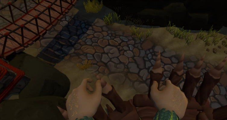
The upside of this design is that the players have a good overview of the whole level. However, we encountered a problem that some players were scared of heights. To mitigate this, we made the platform large enough and added spikes around the edges of the platform. The spikes were also slightly tilted outside. This gave players more courage to spend their time near the edges and even look straight below (see illustration below).
Although players have a good vista of the level from all the locations they can teleport to, each one either has a blind spot (an area not visible to the player) or the spot is ineffective against far away opponents. This kind of approach has two benefits. Firstly, the player has an overview of most of the level at each spot, which means the player can come up with a plan in any location. Secondly, the player is encouraged to move between different locations, adding diversity to gameplay, making the game experience more versatile.
When designing levels in VR it is important to make them feel consistent. The players should also feel comfortable, no matter where they are located.
The part 3 focuses on the graphical user interface (GUI) designs and considerations for TVR.

