In this third part we go through the different interface designs we tried in Tribocalypse VR (TVR) and explain the different levels of immersion and clarity in each of them.
The graphical user interface (GUI) in computer games usually consists of informative or interactable elements such as menu screens, score tables, buttons and levers in the game and many more. Here the visual effects of the camera are also considered as part of the GUI. The GUI in TVR consists of four bigger elements:
- The menu
- Hand tattoo
- Score and leader boards
- Visual effects of the camera
When designing the GUI of TVR, the goal was to create an immersive yet understandable and intuitive user interface. In order for the players to start and exit the game, implementing a functional menu was the first priority among the GUI features.
The Menu
The menu in TVR is a system that consists of functional buttons that allow the player to either select the map, start the match, purchase additional bomb slots or exit and save the game. We had 4 different designs, each with their own pros and cons in regard to immersion and clarity.
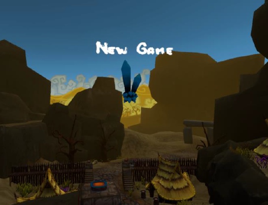
The Crystal Design
Firstly, we tried using floating crystals as menu buttons. These would be placed in air, in a 360-degree circle around the player, around 10 game units (meters) away from the player. They were around 2.5 in-game units high in relation to the main platform the player stood on. In order to interact with the menu, the player had to fire an arrow at the crystal. Upon collision, the crystal shattered and the “button” was pressed.
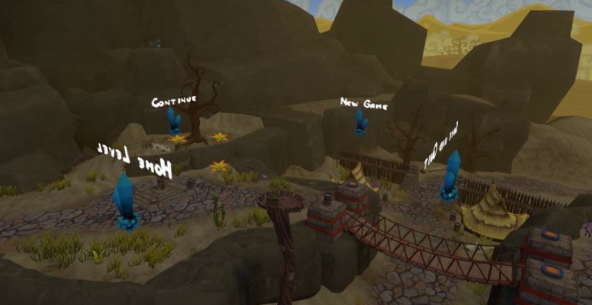
However, this idea had problems with clarity. Since they were floating almost at the height of most players’ heads and around the player, they were quite difficult to spot. One of the reasons being that anything outside the central field of vision gets ignored easily. Another reason for the player not seeing the menu was that the crystals were too spread out. Even if the player did see one of the crystals, the rest of them were out of the player’ field of view, giving the player an impression that there was only one menu button present.
The clarity problem could have been probably fixed by placing the crystals a little bit lower and spreading them out less. A solution would be to add them into a half-circle of only 180 degrees (see image below). So that if the player looks at one button, he can see at least one other button next to the one he is currently looking at.
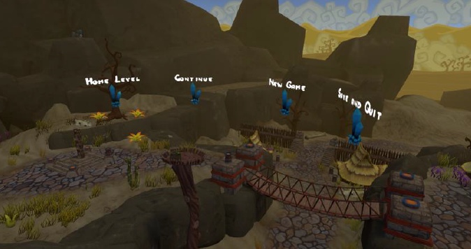
The problem with this solution is that it is not very scalable. If all the crystals were to be at the same height, then the amount of the crystals inside the half-circle would be limited to 4 to 5 crystals maximum. This is due to the fact that the space on the half-circle would run out quite quickly. A solution would be to add multiple rows of crystals. Continuing with the thought of multiple crystal rows, we came up with the tree design idea where the buttons are placed at different heights. The tree solution (described next) turned out to be more immersive than the crystal design.
The Tree Design
The menu tree consists of a big tree trunk, which has hanging signs attached to the branches with rope (see image below). The player has to shoot arrows in order to interact with the signs, similarly to the crystal design. The tree menu design is more immersive compared to the crystal design. The model for the tree trunk is the same as for every other tree that we used in the game. And since those trees matched with the environment, the menu tree matched as well (even though it was much larger compared to the other trees). Secondly, the signs were also made of wood, which matched our art style. Thirdly, whenever the player shot at the sign, the sign would start to move and wobble due to the forces applied to it by the arrow. This was a small detail, which added a fair amount of immersion to the game thanks to its responsiveness to the player input.
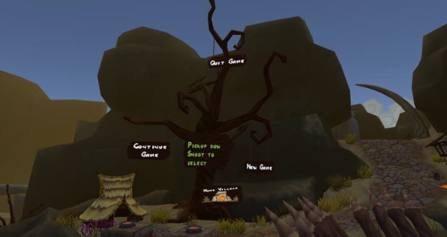
Clarity of the menu also improved a little bit. This was due to the fact that all the menu “buttons” were concentrated in one location. This means that when the players discovered the tree menu, they already knew to look for other buttons, simply because they were very near to the player’s central field of vision. The signs were also placed in a way that the chances of the player hitting the wrong sign would be minimized. Functional signs at the same horizontal or vertical axis were placed far away from each other. Also, the branches of the trees easily led the player’s vision to other signs. The branches of the trees could be considered as navigation paths that guide the player’s vision.
However, the problem with this design was that, similarly to the crystal design, players had hard time finding the menu. This was caused by three reasons. One reason was that the tree was placed quite far away from the player. The players usually expect to see important elements of the game, such as the menu to be close to them.
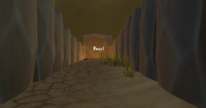
Second reason was that though we managed to create an immersive menu, we made it too immersive. The tree blended into the environment too well. One might think that the bright white text on the menu signs would be visible to the player and he could easily notice the menu. However, this was not the case and is the third reason why the player had hard time finding the menu. The size of the text was not a problem in terms of reading it. All the players were able to read the signs clearly when they discovered them. Before discovering the menu, the players probably did see the text on the menu buttons but did not think them to be important. According to the testers, this was due to the fact that the tree blended in too well with the environment and so did the text. A way to fix this might be to make the text stand out visually amongst other elements of the environment. If the environment is mostly static the text could be animated. Attention could also be drawn to the text by pointing light or scene’s geometry at it (see image below). Sound assisted attention guidance could also work. For example, an announcer or storyteller could point the player in the right direction.
In order to interact with the menu (with the exception of the tutorial level), the player has to pick up the bow and shoot at one of the signs. Its advantage is that it adds immersion to the game. Disadvantage is that it lowers clarity.
Many players that tested TVR (especially those with first time experience with the Vive) tried to place their in-game hand on the button to select it, even though the buttons were around 20 in-game units (meters) away from the player:
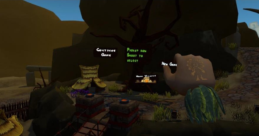
This was not foreseen because the chances of something similar happening in real life were very small. It is not common for a person to try to hit the light switch that is more than 20 meters away from the person. The reason for this was that the hand models in TVR are ~3 times bigger compared to the player as illustrated on a mixed-reality image on the right.
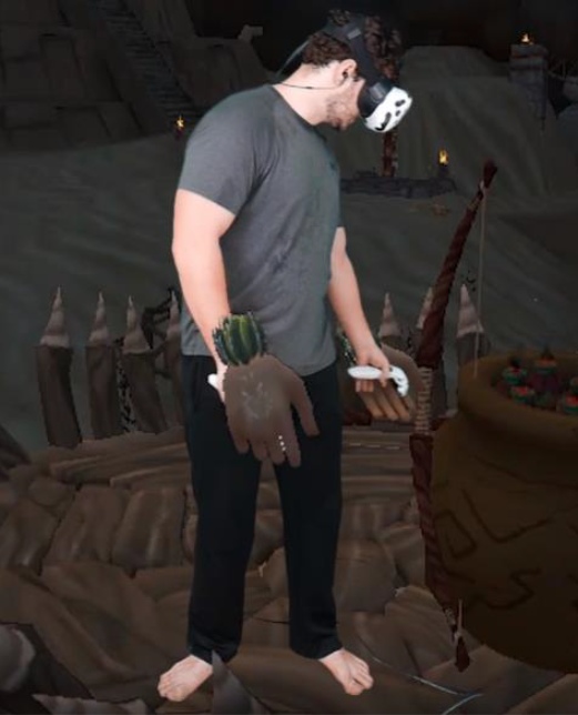
Since the hands were so big the first impression of the players was that the hands were not actually big but instead very close to them. This, for some reason, made them believe that the menu signs were also close to them. The problem seemed to occur less after the players looked around and got more used to being in VR. The problem also did not occur a single time amongst players with previous experience in a VR world.
Another problem encountered while testing was that the players who were not used to aiming with the bow, had problems hitting the wooden signs on the tree menu. This is good in a sense that players can do target practise on the menu signs. If they cannot hit the signs, they most likely cannot hit the moving enemies either. On the other hand, this also caused some frustration amongst some of the players. This was especially the case when the players were at public events and they had audience in the form of other players waiting to try out the game. The frustration was most likely caused by the fact that the players did not want to look bad in front of other players by not being able to hit a menu button. Tutorial level, which has a practise range, is one of the ways to solve this problem. The player can practise hitting static targets, which are not part of the menu. Unlike the menu signs, the targets at the practise range are meant for practising. This was not tested but it can be hypothesised that at public events, the frustration could be reduced by having the player hit targets at a practise range, rather than let them practise on the menu buttons.
The third menu design takes into consideration the fact that players had difficulties with spotting the menu and hitting the signs. Thus, the idea behind the third design was to bring the menu closer to the player.
The Stone Slab Design
The stone slab design is used only in the tutorial level. It was not tested in other levels due to time restrictions caused by the launch of the game. This design uses small stone slabs as buttons that the players can press down with their in-game hands.
The benefit of using this design is that it is immersive and natural to use. The act of pressing a button is intuitive for the players and is more clear than having to shoot arrows at menu signs to activate those buttons. The disadvantage of this design is that it requires space in an area where the player can move. This means the stone slabs would have to be placed sparingly if used in other levels other than the Home Village. Perhaps they could be fit onto the platform that the player stood on. This would however decrease the play area of the player, which is already quite small. Another option would have been to create a separate teleport location for pressing the buttons. This has the potential to reduce clarity because it requires the player to teleport to the menu area each time the player wants to press the button. This would be worsened if the menu area provided no strategical location nor weapons for the player to fight against the enemy. With the tree design, it is theoretically possible to activate the buttons from any location and at the same time battle with opponents. Another option would be to create a separate location in each level for the stone slabs. This would be the menu area, which can be accessed by the player only in between the waves. If the wave ends then the player is automatically teleported to this area. If the wave starts, the player is automatically teleported away from the area.
The next menu design tries to solve the problem of travelling to certain teleport locations to interact with the menu while also bringing the menu even closer to the player.
The Doll Design
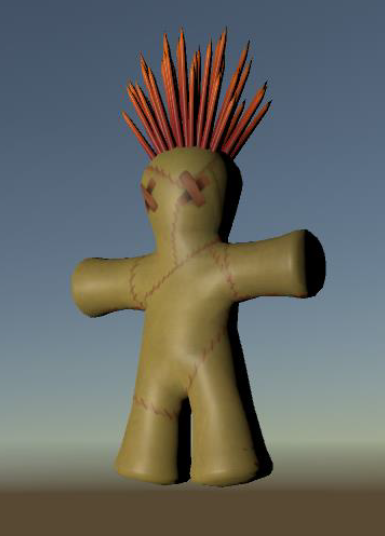 The fourth menu design was planned to be in the shape of a voodoo doll (see Illustration 16 below). This was inspired by the voodoo doll weapon from the previous unfinished Tribocalypse game where the player could attack another player from a range. The player could choose, which part of the doll to hit with a needle: the head, chest or shoulder. Each body part had its own special effect when hit, that was applied to the target player.
Using the doll as a menu would bring the menu closer to the player, making it more accessible and thus increase overall clarity. The menu interaction would not be skill based. As was observed when letting players test the game, they tried to place their hand on the menu signs. Using the doll design, this would have worked naturally and intuitively. Also, the doll would not have broken immersion, since it fit with the art style of TVR. However, the doll was not developed and thus, was not tested. In hindsight, this might have been the better solution compared to the previous ones.
When trying to bring this design to life, certain design questions need to be answered. Does the doll act as any other pickable item in the game? Or is it in player’s hand by default when a level is loaded? How does the player interact with the doll once it’s picked up? Does the player use Vive controller’s touchpad to select the body parts to activate or does the player have a needle in the other hand, which has to be pointed at a certain body part? How to make the doll scalable? These questions and probably many others need to be answered when developing this kind of menu system.
Even though we did not develop the doll design, we did implement a similar feature, for casting spells, which will be the next topic.
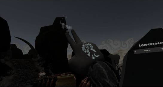
The Hand Tattoo
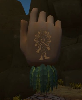 The hand tattoo is a GUI element, which is placed on top of the player’s in-game back of the hand (see image on the right). Its function is to allow the player to cast magic spells. Currently, two spells are included: fire and teleportation. The player can use the fire spell to light either the tip of an arrow or the tip of the spear. This helps the player light up dark environments. The teleport spell is used to move between fixed locations around the map.
The spells can be cast at any time during play when the casting hand is not holding an object. The fire spell can be cast on both hands simultaneously, the teleport spell can be cast with only one hand at a time. To cast a spell, the player must press, hold and release (this will be explained below in detail) the correct area on the touchpad. The touchpad’s top half area is used for teleportation, the bottom half area for the fire spell. The touchpad can be seen as a 2D grid with the 𝑥 and 𝑦 axis, both ranging from values -1 to 1. The centre of the touchpad is also the centre (zero point) of the grid. In code, if the touchpad detects a press, it is possible to get the exact location of the player’s finger on the touchpad. In TVR’s case, the grid is separated into five different areas depicted on the image to the right.
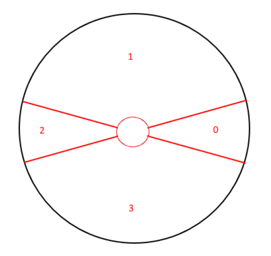 The left, right, top, bottom and middle. The reason for creating an empty area in the middle was to encourage players to move their finger in the extremities of other areas. If the player put their finger in the middle of the touchpad, up to 4 spell areas could easily overlap (before creating the empty middle section). This was confusing and thus reduced clarity of the spell casting system.
Initially we planned to add 4 spells to the game. This meant mapping 4 inputs on the touchpad, essentially slicing the touchpad into 8 imaginary sectors. In our first iteration the spells could be cast when the correct area of the touchpad was pressed and held down without a pre-cast effect that would be caused by simply touching the touchpad. The problem with this was that the players did not know for certain, which spell they were going to activate before they pressed the trigger. It is quite difficult, if not impossible, for the players to see where the boundaries of the spell casting areas on the touchpad are. This resulted in players frequently casting wrong spells. Furthermore, new players not familiar with Vive thought that the touchpad was one large button. They thought it did not matter on which part of the touchpad they placed their finger on.
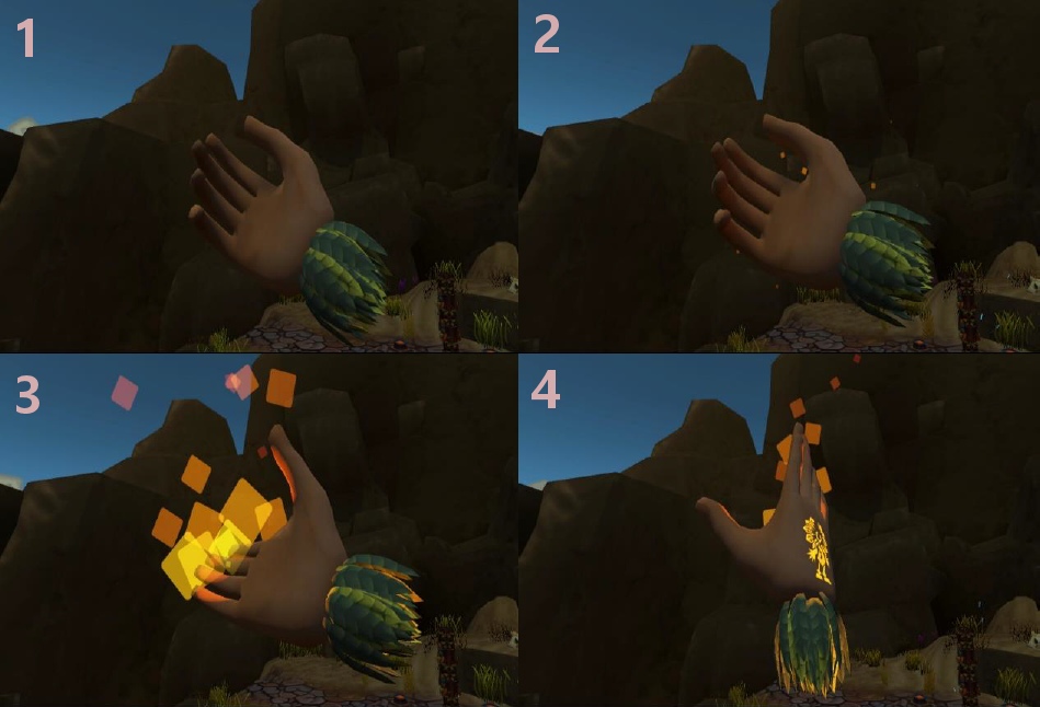
The touchpad’s touch functionality was used to fix the problem of casting undesired spells. If the player touches over the touchpad without pressing down, it is seen which spell will be cast when pressing the touchpad down. On the image below: 1) – touchpad not touched, 2) – touchpad touched, 3) and 4) – touchpad pressed.
The combination of touch and press mechanics can both reduce and increase clarity. It increases clarity by helping players cast the correct spells. However, often when players were hovering over the touchpad and the pre-cast effect started playing (the small fire for example), players often thought that this effect was the spell at its maximum effect. They then tried to light arrows and spears with the small flame effect without pressing the touchpad down. This caused confusion because they already saw the fire effect and thought that this was enough to use the spell.
Casting the teleport spell proved to be problematic as well. If the player wants to teleport somewhere they have to:
- Press touchpad’s top sector
- Point towards teleport area
- Release the sector while pointing towards the teleport area
If the player touches their finger over the teleport segment of the touchpad then a grayscale effect will be applied to the camera, making player camera’s colouring scheme use a grayscale effect. The only exception being the teleport spots, which will be lit with a blue light and decorated with particles flying towards the sky. This helps the player find the teleport locations. It should be noted, however, that using a blue colour on a black and white (grey) background might not be the best option of colour because it blends in with the background pretty well.
If the player holds down the touchpad, then at each frame, a capsule cast is done, which can hit a collider centered around the teleport spot. If collision occurs then a channelling effect is displayed and after every 0.1 seconds a weak haptic pulse in the controller is activated. Small particles will fly from the pointed fingers of the player’s hand towards the teleport location. At any time during channeling, the player can teleport to the pointed location by releasing the touchpad.
The teleport mechanic’s clarity also suffered from the touch and press mechanic. Players often assumed that when they touched the touchpad then they would be able to teleport and the channelling would work. This is caused by the small effect, which is shown similarly to the fire effect upon touching, shown on the image below.
Another problem was pointing at the target location. We tried to make the capsule cast as wide as possible to make pointing as simple as possible. However, since the players usually do not look down their in-game hand when pointing, they often pointed their hands too high or too low. This means no collision happened and since they saw the preview effect at the tip of the fingers, they often became confused.
However, the biggest problem was that the players did not understand they needed to release the touchpad in order to complete teleportation. Those players who got to the phase of channelling (seeing flying particles and receiving haptic feedback) often thought that the teleportation would automatically happen after a small period of time. This was due to the fact that players are used to the channelling effects in other games, where in order to complete the channelling, the player does not need to add any additional input. In the case of TVR, however, in order to successfully complete teleportation, the player has to release the touchpad. This was also counterintuitive due to the fact that players’ first thoughts were that if they were to release the touchpad while channelling, the channel effect would simply get cancelled.
In order to increase clarity for the teleportation spell, the channelling should automatically end in a success after a short amount of time has passed, rather than wait for player’s input. This of course does not have to be the case for other types of spells. For example, if the player is able to cast a fireball that could be launched, then the hold-press-release mechanic could be quite useful. For example, a fireball could be charged up by holding down the touchpad. This would increase its damage and size. After reaching its maximum size, a sound effect might start to loop to indicate that the channelling has reached its final state. After reaching its final state the ball is not launched automatically. Instead, the player can aim the ball, and when ready, launch the ball by releasing the touchpad. The input pattern, which the player uses, should be consistent in order to not confuse the player.
In addition to the spell casting issues, visibility of the tattoos is another problem for newcomers. Since the tattoos are on the back of the hands, the players rarely notice them. This is due to the fact that attention is withdrawn from the area of the visual field where the player’s own hand is currently at.
While the used solution is immersive, it has little clarity despite the fact that it is taught in the Home Village.
Score and Leader Boards
In addition to the tree menu, there are two more GUI elements located in the playable levels of TVR. One of them is the wave end result board (score board) and the other one is a global leader board (see image below). Both blend in with the environment in order to be immersive and both are also clear about the data they represent. They were placed and sized accordingly so that they would be noticeable and the players would see what is written on them. It was important to give as much information to the players without overwhelming them. In our design we decided to use as many icons as possible since these are easier and faster to make sense of than plain text. Reading text in VR requires fonts to be large enough because of a relatively low resolution of the screen. This however can create problems with available space.
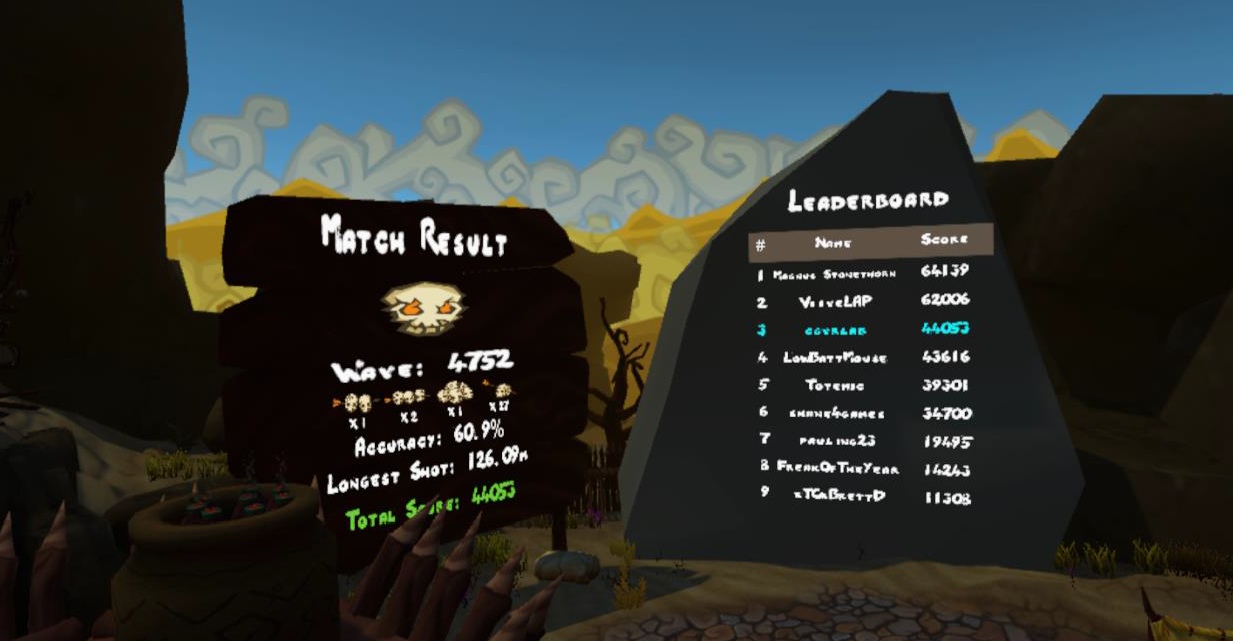
The wave end result board contains statistical information about the previous wave. This information is displayed upon wave completion and it contains statistics about player’s accuracy, long distance shots, combos and overall score. Different designs were created for the result board (see the image below). First of these designs consisted of having multiple boards, which would be much wider than the final result and would also display more data.
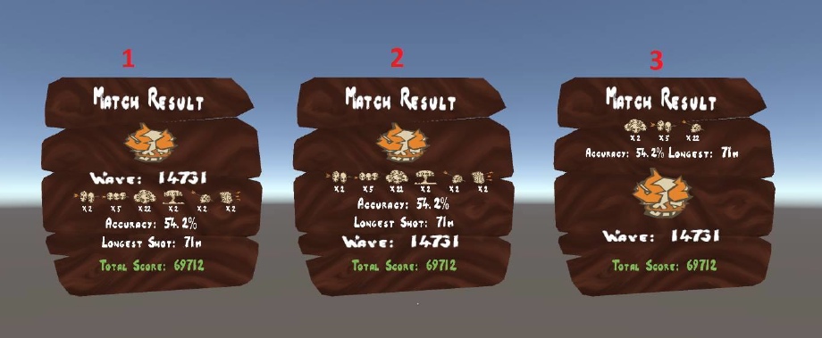
Second idea was to create a board with a timer. Similarly to the previous design, this one would also display 3 different boards. However, with this design, only one of the boards would be visible at any time. For example, the data on the board would change every 5 seconds and this would loop until the level is changed or until the next wave starts. Thus overcoming the available space problem. However, if the player is at the first panel and wants to view information on the third one, he has to wait for 10 seconds.
The benefit of these designs is the ability to display a lot of information. Such as the exact amount of different enemies killed, accuracy with different weapons and so on. The downside of the first solution is that it would take up too much space. To make the statistics on the boards visible to the player, the boards would have to be scaled up quite a bit. Having three massive boards in the levels might draw too much attention, reducing immersion. The available space in the level might also become a problem. There were already problems placing all the GUI elements in the Stonehenge level due to that level’s small size. Having 3 big boards would amplify this problem. Another solution instead of the timer would be to use a wooden sign to change the boards. This sign would work like the ones on menu trees, which can be activated when shot at.
The timer design could have been used, however in the end it was decided to simply use one panel, which would display only the most important statistics to the player. This was simple to read and also had no extra functionality, which would have increased the complexity of the GUI and potentially reduce the clarity of the system.
The part 4 focuses on the directly manipulable items and their mechanics in TVR.