During your studies, there are many instances where you need to draw a picture. Those can be for example course homework reports, presentation slides and, most importantly, your thesis work. The type of picture or illustration you need to make depends on your task. Sometimes it is an annotated screenshot, sometimes a plot of a mathematical function, sometimes one of the many types of graphs for visualizing some data, its distribution and statistics. Thus you should pick the right tool for the job as this will make creating these illustrations easier and the results prettier. In this article, we will look at some common tools that have been useful in different situations.
Regardless of the tool you use, you need to be aware of file formats to save your illustrations in the correct one:
- PNG – This is used when you have a small number of colors, the resolution is not too big, you need a transparent background or want to preserve the fine detail. Your charts, plots, diagrams, icons and game graphics are in this format.
- JPG – This is for pictures that have a large number of colors, big resolution and the fine detail is not that important. Your photographs and sometimes game screenshots are in this format. It has a compression level, which should never be below about 95% (quality).
- GIF – This is for making animated pictures that have a small number of colors and a low resolution. Nowadays it is often better to have a video clip instead of a GIF, but when you decide to use a GIF, make sure to optimize the color palette, for example with ezgif.com or ffmpeg.
In the end your picture should be a couple of MB max in size. When you have an illustration that is over 2-3 MB, then you probably have the wrong format, compression or resolution. The only exception is when the illustration goes only to print. For your presentations, thesis, webpages etc you do not want too large illustrations, because they will unnecessarily eat up performance. Especially if you have many illustrations there.
Raster and Vector Graphics
You might be wondering where would you even use raster or vector graphics during your studies. In reality, there are actually many instances where using a raster or vector graphics editor can benefit you greatly. Starting from just video game graphics (sprites, textures) and other illustrative material you might want to make to get your point across. But even when you are not designing new creative illustrations, you can use these tools to enhance and annotate screenshots or photographs. Of course, these are also used for promotional material like banners and posters.
 |
 |
 |
Do not let the examples fool you, these tools are used for all sorts of professional illustrations and designs.
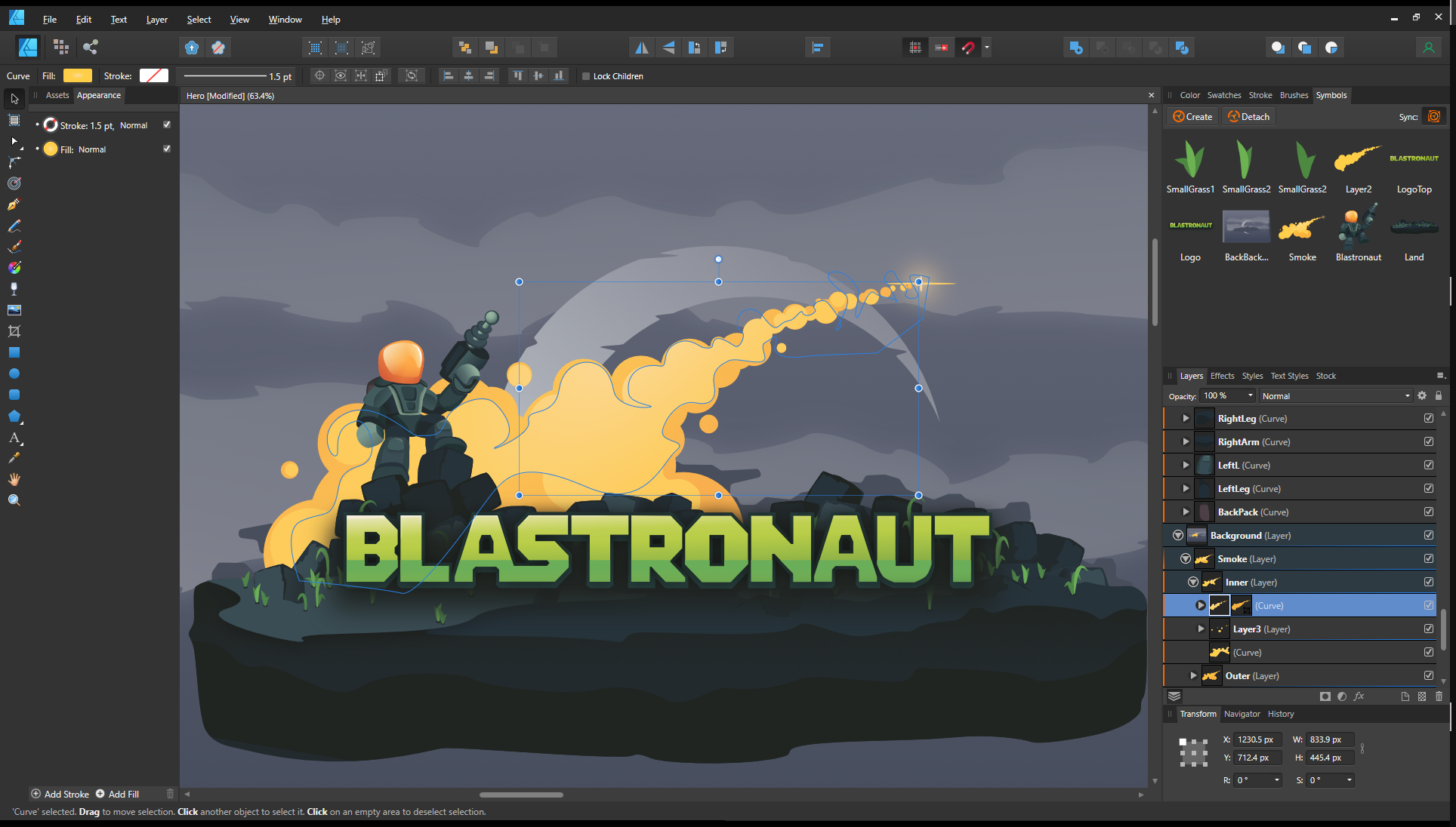
 Paint.NET
The student’s go-to software, when you need to do something a little more advanced than just simple crop and copy-pastes (for which you could just use MS Paint). The major advantage of Paint.NET is the layers functionality. You can put your annotations or additions to different layers and move them around separately from the base image.
The downside of this tool is that it is solely a raster editor. This means that when you add things like text, lines, arrows, boxes etc, then they are rasterized right after you have finished adding them. To change them later on you either need to change them with raster editing or create new elements. When coming back to an illustration several months later it might need some trial and error to find out for example what font and font size was used for some labels or text before.
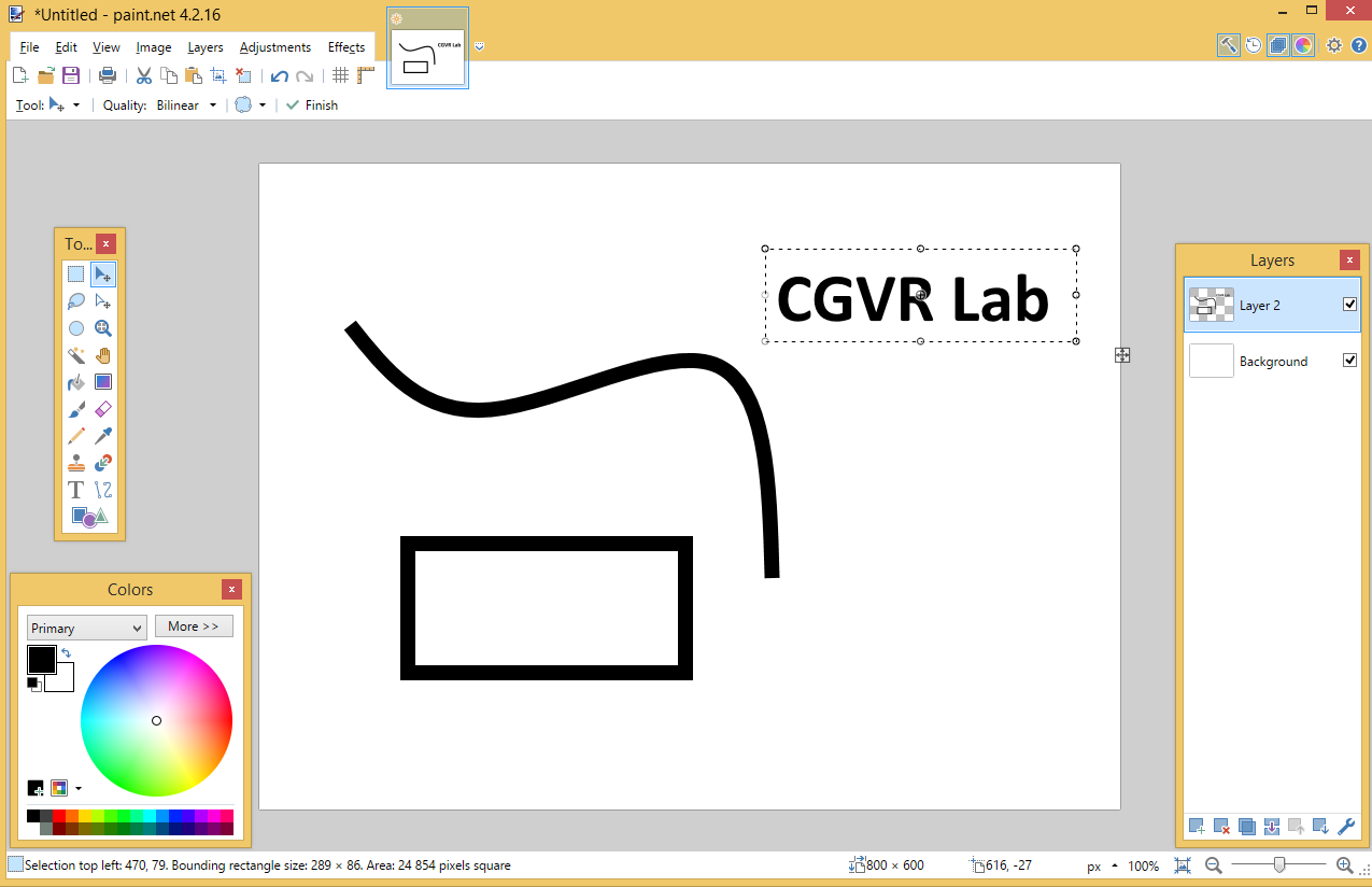
Paint.NET is free, very easy to use and the existence of layers and a good variety of both raster and photomanipulation tools (eg curves, levels etc) make Paint.NET good for some very quick and simple work.
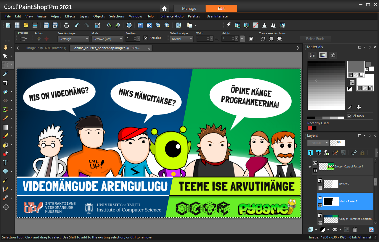
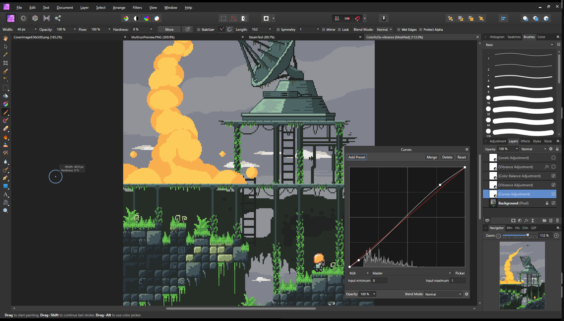
 Corel PaintShop Pro
PaintShop Pro is a professional tool for both raster and vector graphics. If you like Paint.NET, then this is that on steroids and much more. It has great functionality for photo editing like denoising, different blurs and sharpness tools, lens distortion removal and so on. These and all the raster graphics tools are comparable to the Adobe Photoshop software, but PaintShop Pro also features vector graphics editing, thus combining Adobe Photoshop and Illustrator into a single software. This is achieved by having different layers for raster and vector graphics in a single image, not to mention common functionality like mask and adjustment layers. The raster graphics also support pressure-sensitive stylus support with configurable options on what the pressure, tilt angle, direction and other things change for a brush.
PaintShop Pro is not free software. It has a one-time payment of around 40-60€ for one version, which is a really good investment. Compare this to the monthly fee of Photoshop, which is about 12€, and then add to this Illustrator’s 24€ and you pretty much pay the same amount monthly for the Photoshop + Illustrator package, which you would pay just a single time for PaintShop Pro.
I have been using PaintShop Pro for well over 10 years and it has never let me down.
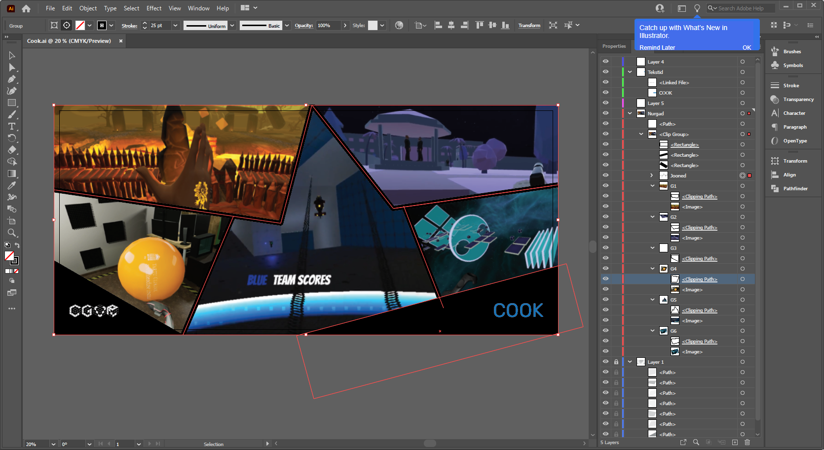
 Adobe Photoshop and Adobe Illustrator
Probably the most famous digital art software comes from Adobe. Photoshop is great for raster graphics, including digital art, texture painting and so on. It is quite similar to PaintShop Pro and does support similar vector graphics functionality. Text can be added and changed afterwards, paths can be created and modified. As it is so popular, many printing companies also accept the Photoshop file format directly.
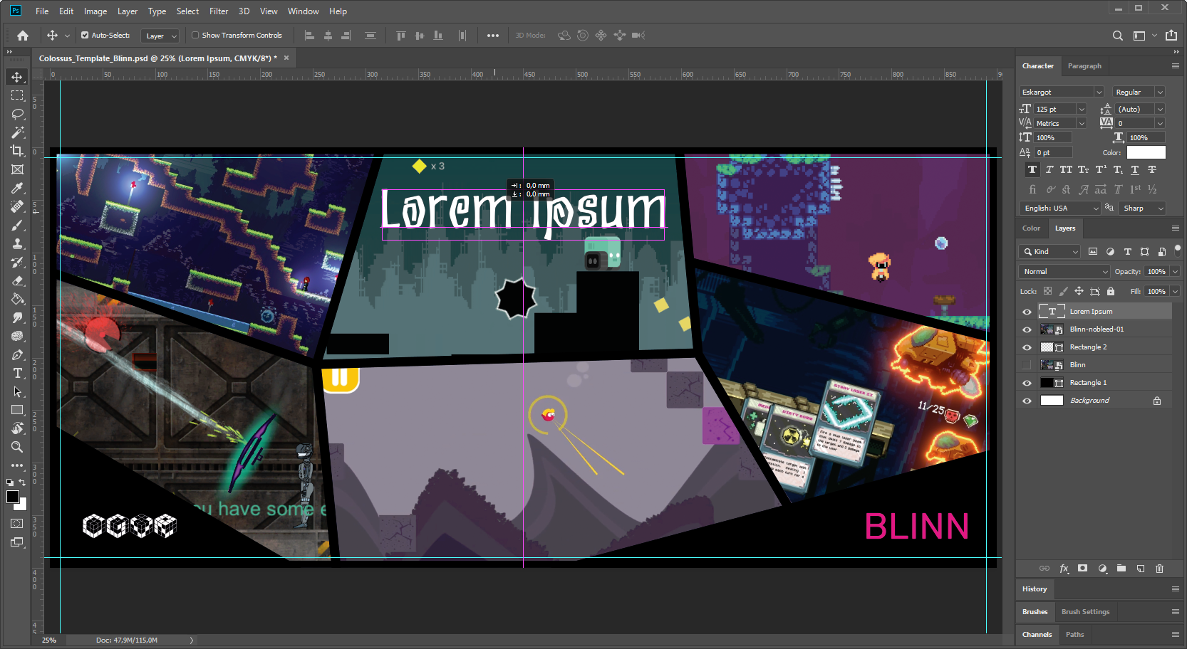
However, when it comes to Adobe software, I usually design posters or illustrations in Illustrator instead. There are a bit more tools for setting the layout and the vector graphics tools there are more comfortable. There is less fighting with the software to get a good design going.
Both these software have a monthly fee. So it might be a bit difficult or costly to use them. Although I do think that the layout design capabilities of Adobe Illustrator are very useful. For students and educators, the monthly fee for all the Adobe software (this also includes a really good video editor Adobe Premiere Pro for example) is about 20-30€, which might be worth the price if you are working with multimedia often. An older version – Photoshop CS2 is also officially available for free.
 Affinity Photo and Affinity Designer
When paying a subscription fee for the Adobe software is overkill for you, consider Affinity Photo and Affinity Designer software. These are pretty much identical to Adobe Photoshop and Adobe Illustrator both functionality and UI-wise, but they have a single purchase business model.
Both of these software also open the corresponding Adobe software files from Photoshop and Illustrator. Our lab computer CGVR-Walter also has these installed for student use. So, if you need to do some graphic design or just want to try this software out, you can do so in the lab.
 GIMP and Inkscape
When it comes to free software, the GIMP and Inkscape combination may be a good one, especially if you like open-source software and Linux. From personal experience, both these have a bit of a weird GUI if you are used to other popular tools and program layouts. For example, in Inkscape the fill and outline colors are set from the bottom of the window. Usually, the bottom of the window in Windows software is for showing some status information only. Thus new users accustomed to Windows software may have a hard time figuring out how to do even a basic operation like changing the color in Inkscape. These tools have a bit of a learning / re-adjustment curve to using them.
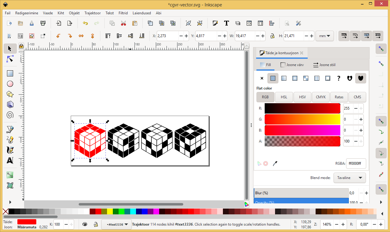
Also, if someone can tell me, why is the tool for drawing a spiral so important that it merits the position in the top-level menu, then let me know.
 Krita
Krita
If you are into digital art and drawing, then one quite nice and simple free software is Krita. It has a variety of pretty brushes and works really well with a graphics tablet.
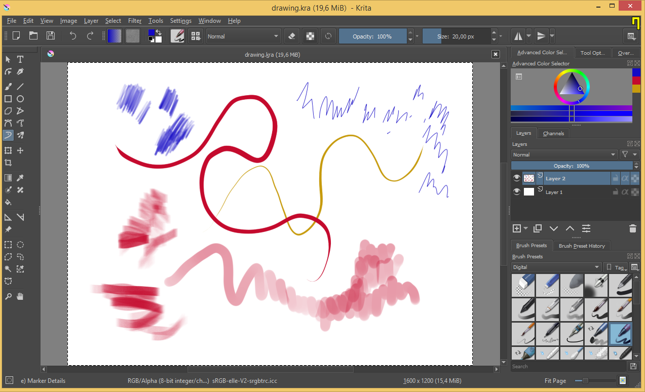
Krita is likely a good free solution if you want to draw pretty pictures by hand for your game graphics or otherwise.
Mathematics Illustrations
Some geometrical illustrations can also be made with the vector graphics programs listed above. However, it is usually better to use dedicated software for that too. Software, which would allow you to make sure everything is mathematically accurate as well as looks good.
 |
 |
 GeoGebra Classic 5
The best tool for geometrical and mathematical illustrations is GeoGebra Classic 5. It allows you to mathematically define geometrical objects like points, vectors, rays, circles and much more. All these objects can be defined with relationships between them. This allows you to not only visualize a geometrical system but also simulate it. You can visually see if your formulae actually work out geometrically as well. Coupled with the possibility to add variables and sliders to your system and change the visual look of your objects with ease, this is a must-have tool in your toolbelt.
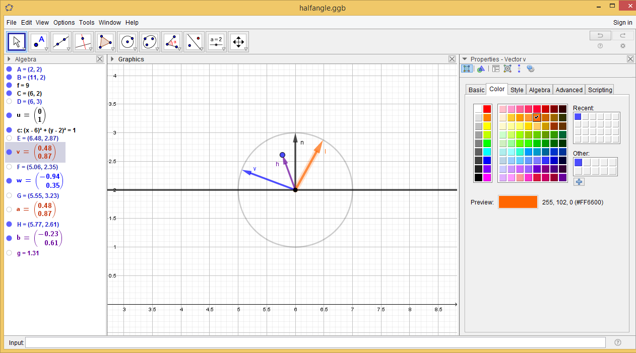
Unfortunately, the Classic 6 version and the GeoGebra web app are not half as good to use as Classic 5.
Data Visualization
When it comes to data visualization, you need software that not only has a couple of bar charts to visualize the data, but also has other types of charts that help you analyze the data. These charts are for example violin and box plots. Furthermore, you might want some fanciful chart types too, like streamgraph, Sankey diagram, spiderweb etc, to visualize the data in a spectacular way.
 |
 |
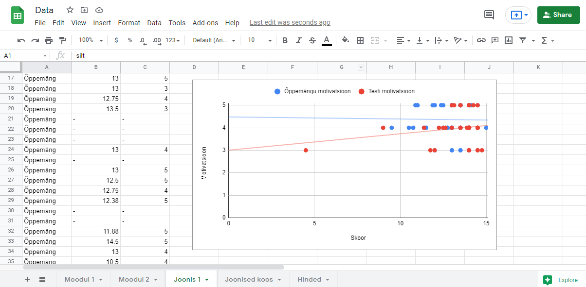
 Microsoft Excel, OpenOffice Calc and Google Spreadsheet
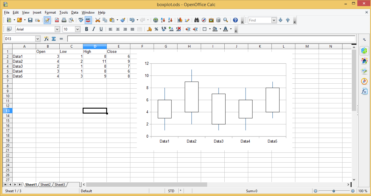
The first and sometimes the primary tool to investigate your data will be a spreadsheet program. The core course, where this software is taught is Computer Handling (MTAT.03.010). Be it Microsoft Excel, Google Spreadsheet or OpenOffice Calc, they all pretty much have the same functionality. You can make basic graphs. While you can do quite interesting things with just these, none of them include many other graph types besides the basic ones.
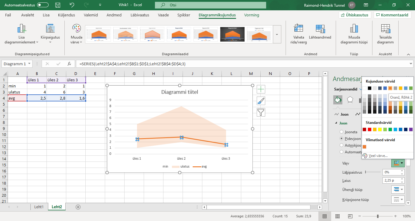
While it is technically possible to render a box plot with these tools, they all require you to specify the minimum, maximum and quartiles yourself. You can make a formula do it, but it still seems an unnecessary extra step. One would expect you put in your data itself and get out a box plot, violin plot or the like.
Still, it provides some quick visualization of the data so that you can see right then and there if it is even meaningful to plot some more fanciful charts or not. You can get a quick grasp of the data yourself at the same time you are working on it.
Given that two of these spreadsheet software are free, they should be the first place where you get some charts out. You might even style these charts there such that they can be used later on in your presentation or thesis. Such that they will fit together also with the more fanciful charts created with other tools later on.
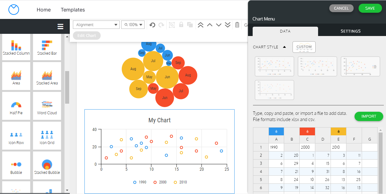
 Plotly
The easiest way to get violin, box or a lot more different charts is the Plotly Chart Studio web app. Being a web app it is a bit weird to use, especially when it comes to saving your data and plots. Namely, you save both of them separately and free users can only save them publically. Regardless of that, the Chart Studio is quite easy to use and provides a good set of charts and a large number of customization options for each.
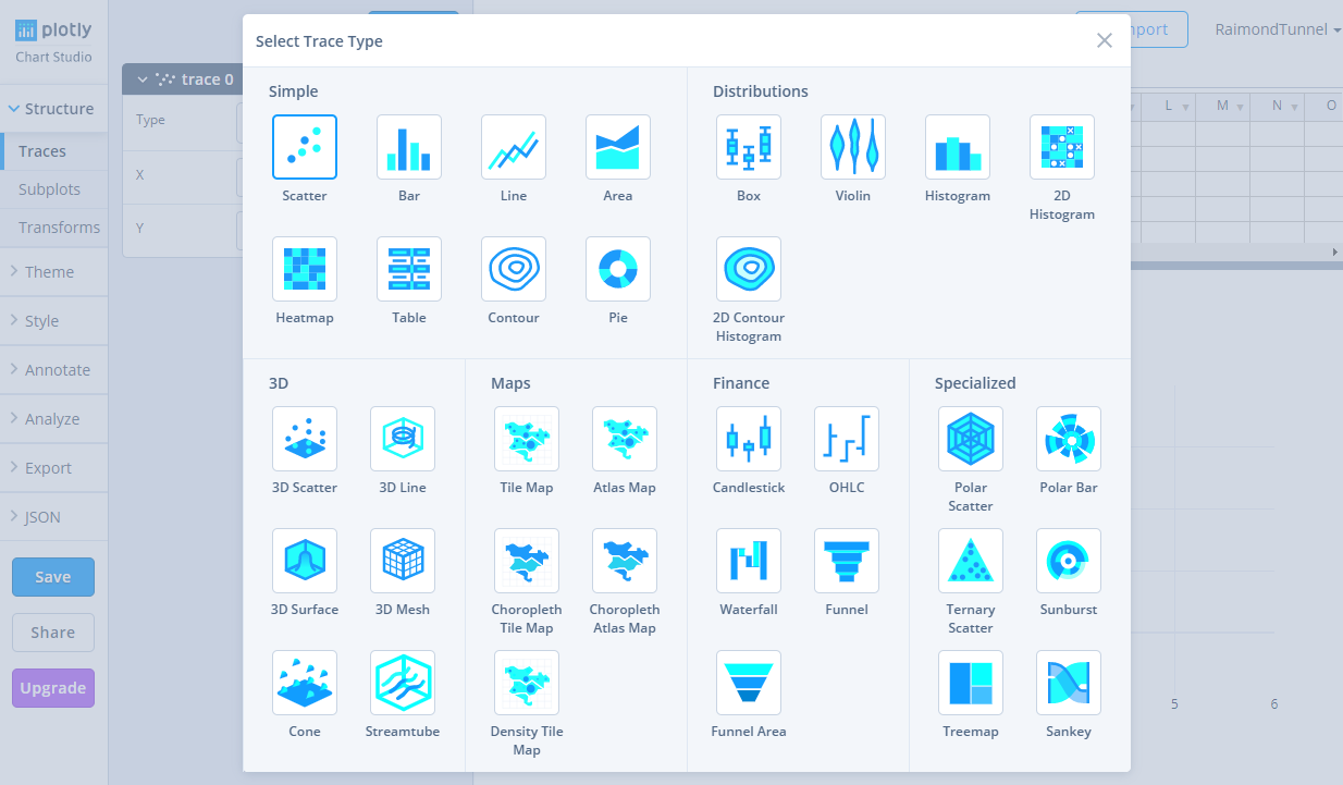
To get a violin plot you just paste in your data and add a trace, selecting the correct column.
When using a web app is either tedious, has bugs or the saving seems unreliable, then Plotly also has a very nice JavaScript library available: https://plotly.com/javascript/
With the library, you can create the plots on your own computer and save the script files separately. It is also useful for visualizing data in information systems.
 Highcharts
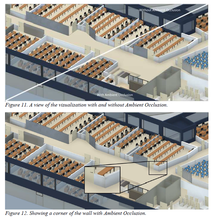
Another JavaScript library is Highcharts. It is a very powerful library with a large number of different charts, customization options, and several different modules for different types of charts. This allows to make some really nice charts, for example here is a one we have in the Evolution of Video Games course:
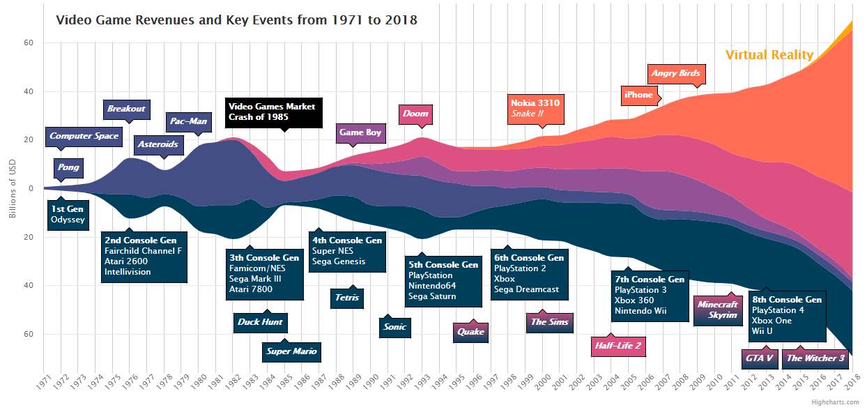
Unfortunately, at this moment there is no built-in violin chart in Highcarts. Still, if you like scripting some JavaScript, this library allows you to make some really cool charts. They can also be interactive and animated on some webpage. We also use Highcharts on our thesis statistics page to visualize all sorts of automatically found data about our defended theses.
 Venngage Chart Maker
One infographic-oriented tool is the Venngage Chart Maker, which creates some really pretty charts with their web app.
Getting to the part, where you can actually get a blank canvas and add a chart to, is a bit tedious – as far as I understood, you have to select an existing template and then delete everything there. However, when you actually get to put your data in a chart, the result looks really nice. So if you want some simple but nice-looking charts, then Venngage might be a way to go.
 R
R
 R is a free software environment for statistical computing and graphics, used widely for example in data science and psychology research. The basic software allows to create a wide array of highly accurate plots, but the true visualization power in R come with the popular and versatile package ggplot2. It is also worthwhile to check out the many example galleries.
In our experience using R can mean changes to how you think about data. R has a syntax, which is not that familiar to people who know regular imperative programming. So, it does have a learning curve and if you like programming, you might find R tedious to use. The upside is that it does have an extensive amount of data analysis tools built-in. If you are trying to find an implementation of a data analysis method, R most likely has it.
Diagrams
Sometimes you need to make diagrams about some processes or system architecture. Diagrams, where you show the relationships between different things, the order of data flow, or semantic encapsulation.
 Diagrams.net
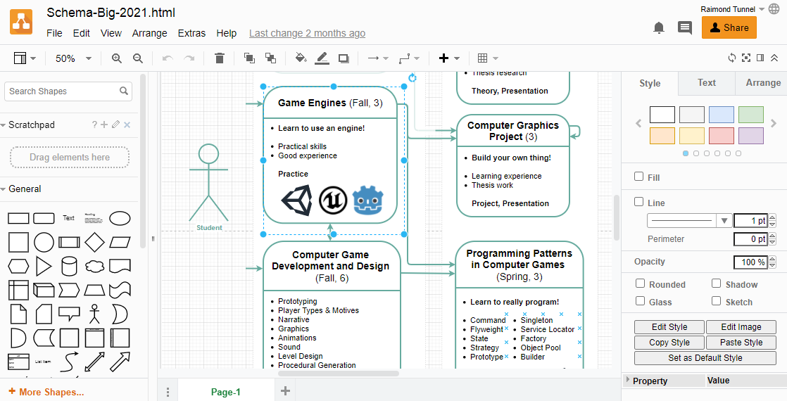
One extremely useful web app is diagrams.net (previously draw.io), which allows you to create all sorts of diagrams. It has different elements ranging from just basic shapes to different UML and Entity Relation objects. For example, our Students’ Courses Map has been made with diagrams.net.
Everything is sufficiently customizable to create some uniquely looking diagrams. There can be a bit of tedious work involved there as the node connection lines tend to need some manual encouraging to stay nice.
 Google Drawings
If all else fails, then you can, of course, make some simple drawings with just Google Drawings.
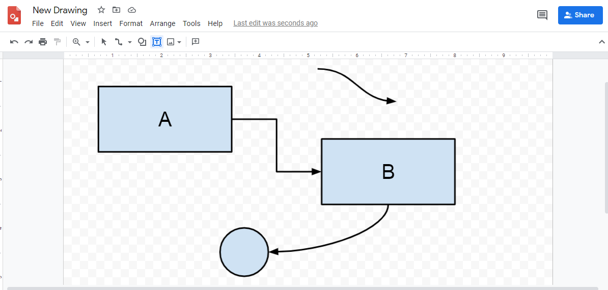
With Google Drawings, and of course with other tools as well, try not to make the drawing look like some clip art from the 90s. Rather find a unique style, be creative, neat and consistent!